PowerBI for Librarians 2023
16 Jul 2023This page details the notes for the VALA 2023 TechCamp PowerBI Workshop
All files are available on GitHub at:
Introduction
- About me
- What is PowerBI
- What the focus is today
- 80% will be about visualisation and dashboard creation
- Links
- Files that will be used in the workshop: bit.ly/vala23-powerbi-files
- Detailed notes for the workshop: bit.ly/vala23-powerbi-notes
- Slides: bit.ly/vala23-powerbi-slides
What is PowerBI and why would I use it?
So we can go from Excel and CSV files, to a system that can produce meaningfull dashboards and reports, can used to to analyse data, create insights and are easily shareable.
Discuss the difference between Excel and PowerBi and why use 1 or the other
Why are we doing this?
- Why PowerBI?
- Desktop is free, and its
- Microsoft makes available the professional and enterprise versions of PowerBI very cheaply to public institutions - meaning most universities will already have PowerBI available for library staff to use - or at least request access to
- Why visualisation?
- Librarians know the stories of how your libraries are operating and evolving
- But if we can’t present data to support our stories and feelings, we can’t have useful discussions with senior management etc. about the future of your libraries
- Give you tools and knowledge so you can have a positive impact for your libraries
- Access to data is the main problem
Links
- This document: https://justin.kelly.org.au/powerbi-for-librarians-2023/
- Presentation: https://bit.ly/vala23-powerbi-slides
- Files
What we are going to do:
Turn an excel/csv file into a maintainable, share-able and accurate dashboard, that allows you to answer complex queries simply using Power BI.
We’ll use the loans data that data.gov.uk has made available. In this case, loans for 98 Northern Ireland public libraries
Section 1
What is PowerBI, intro to its interface, and import a CSV
Import the data
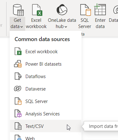
Import a CSV file using the Text/CSV option from the Get Data menu
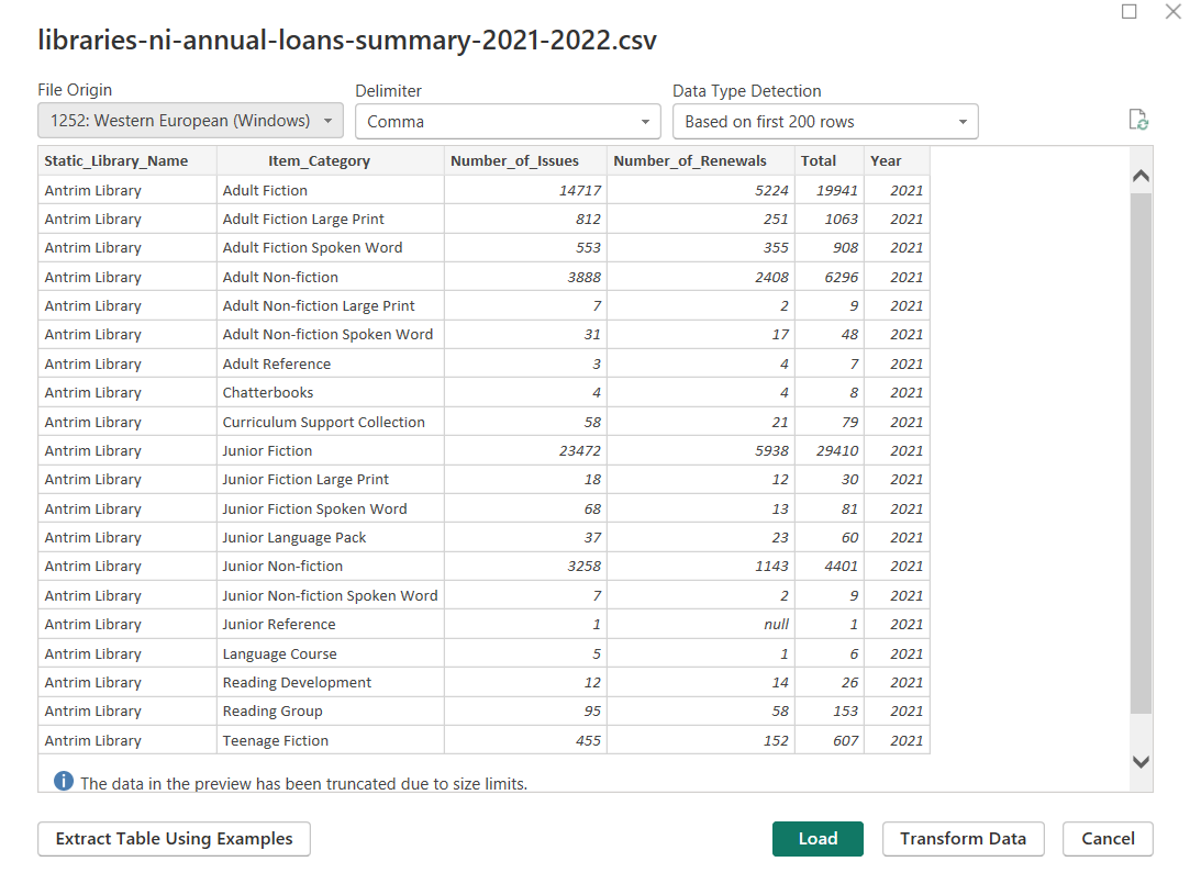
Import the Loans file libraries-ni-annual-loans-summary-2021-2022.csv
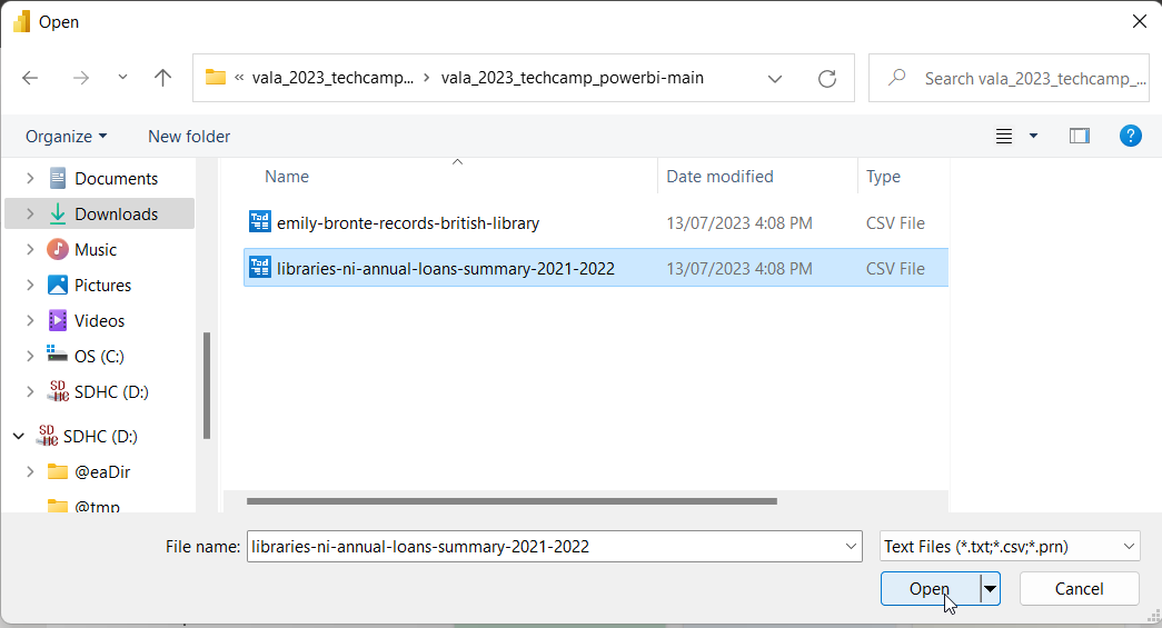
Review contents and select Load
This will load into PowerBI the contents of the libraries-ni-annual-loans-summary-2021-2022.csv file, and will create a table in PowerBI called libraries-ni-annual-loans-summary-2021-2022
Save the file
If you’ve managed to get this far - congratulations - you’ve just completed one of the hardest probably - just getting the data and imported into PowerBI
Section 2
Create some reports
Go into Report view

And now we’ll cover the most use PowerBI visualisations
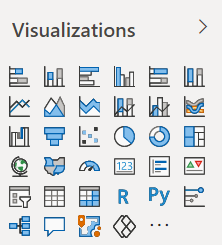
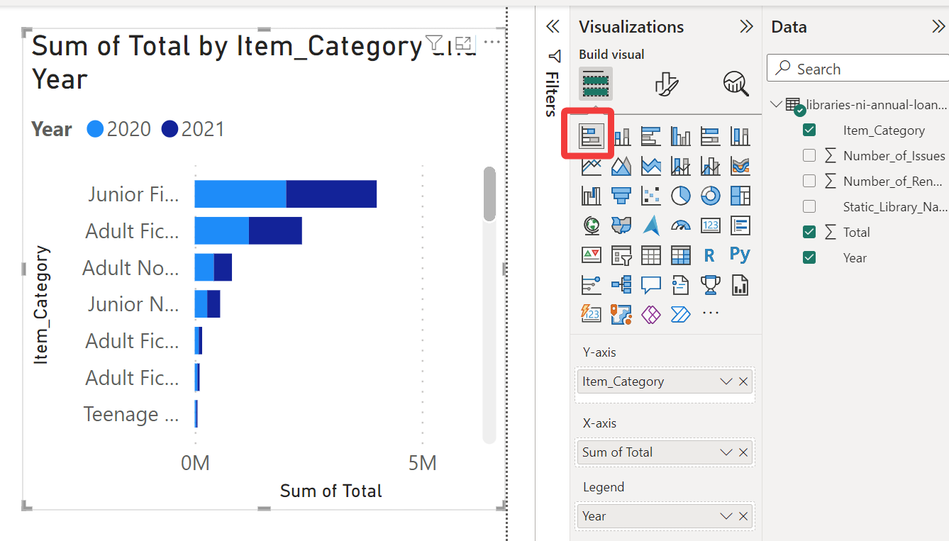
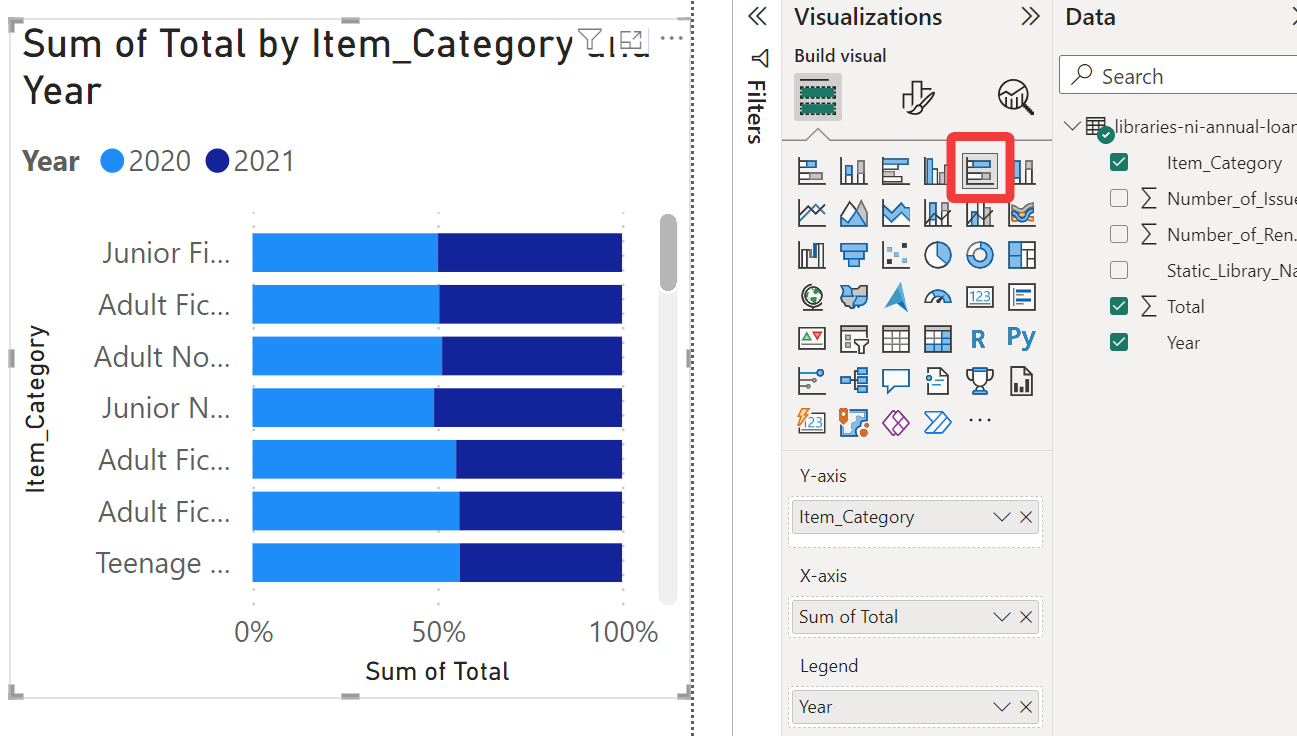
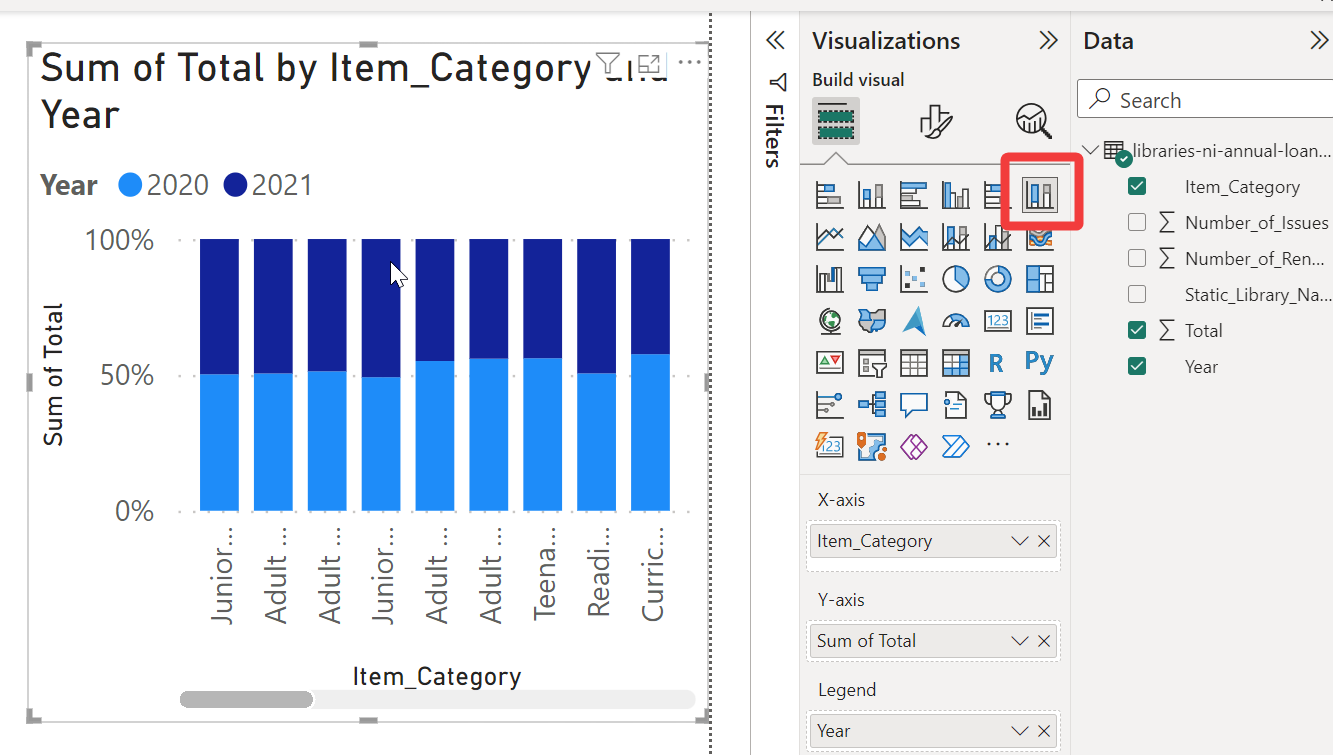
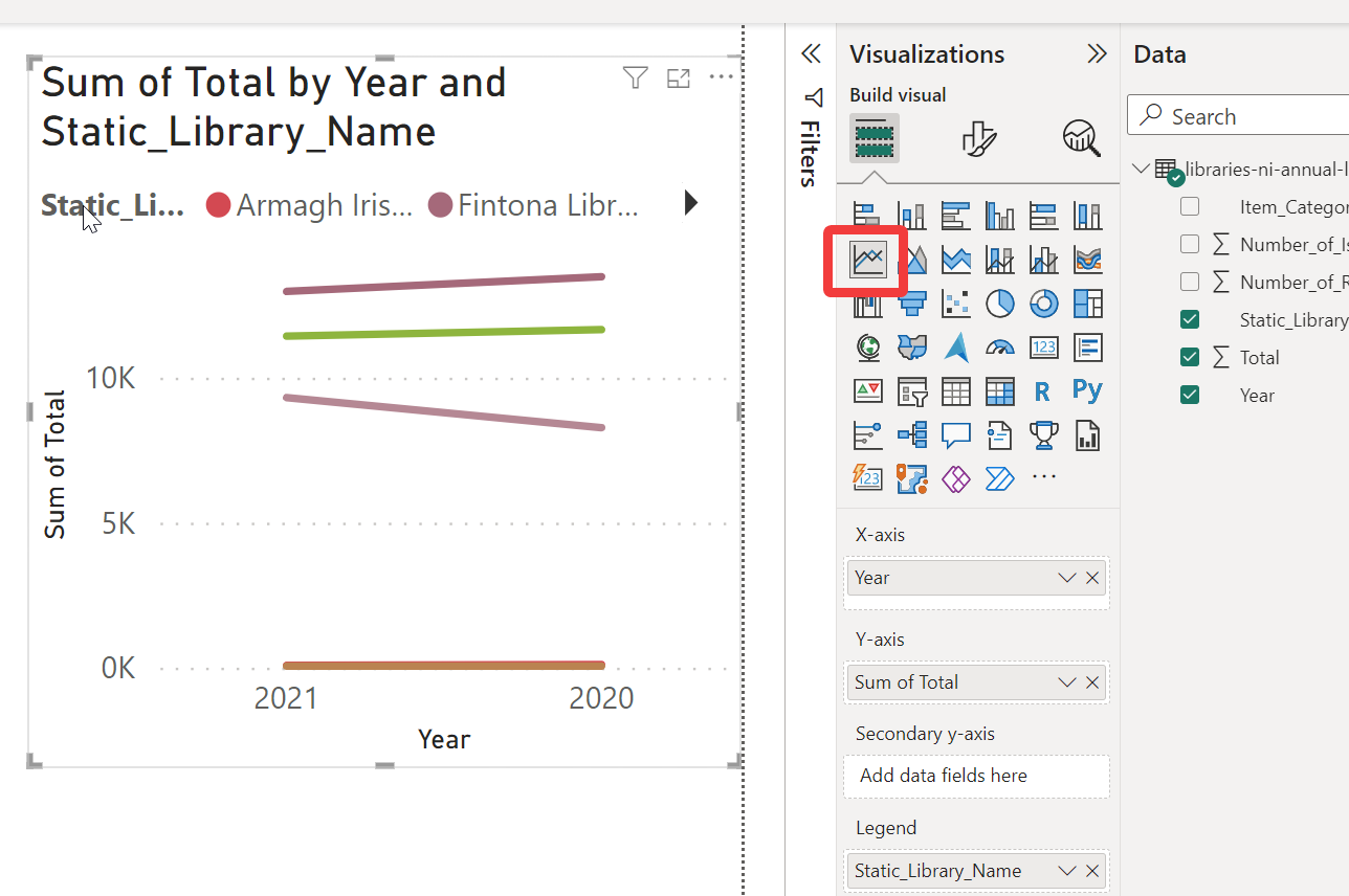
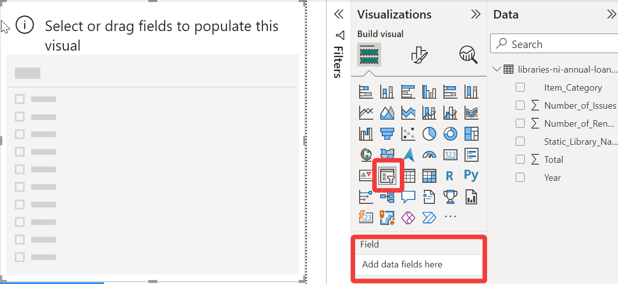
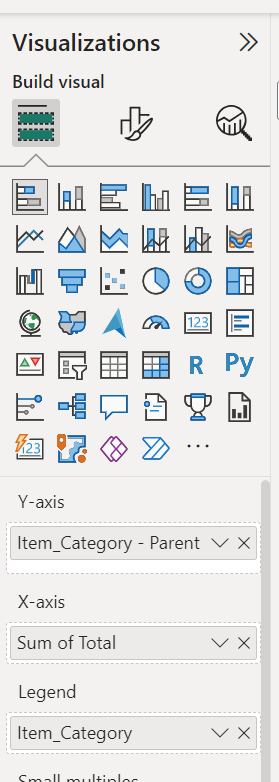
Click on the first visualisation in the top left of the Visualizations pane. This will add a blank stacked bar chart to the page
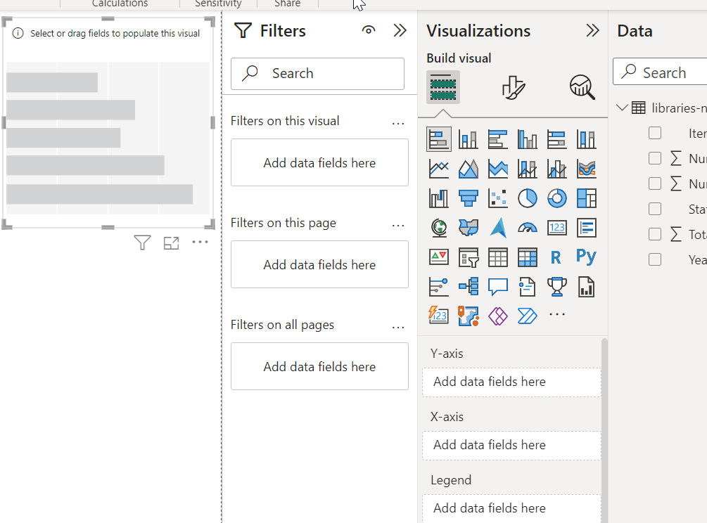
Now click some data elements from the Data pane, such as Item Category, Total, and Year.
PowerBI will automatically place the different elements into the Y-axis, X-axis and Legend section of the Visualizations pane.
Try moving the different data elements into the different axis and legend sections to test the results.
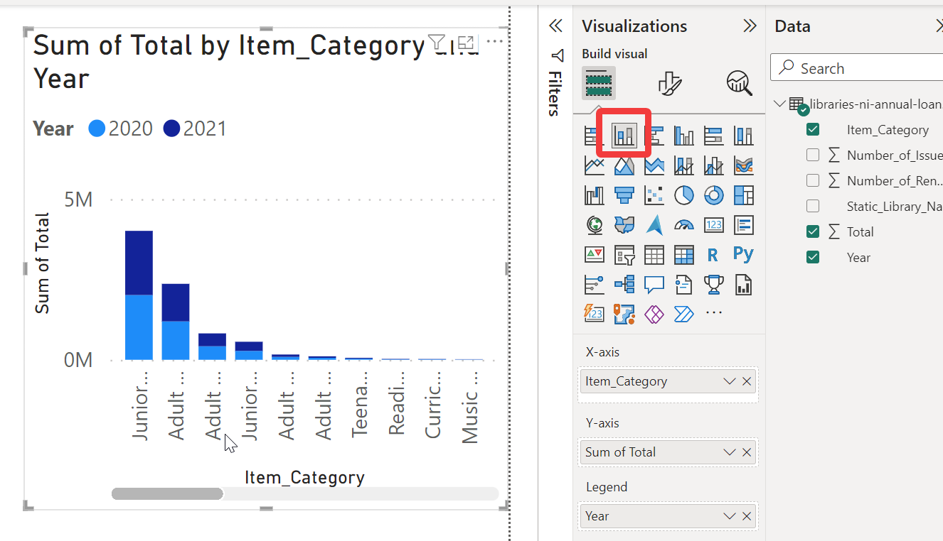
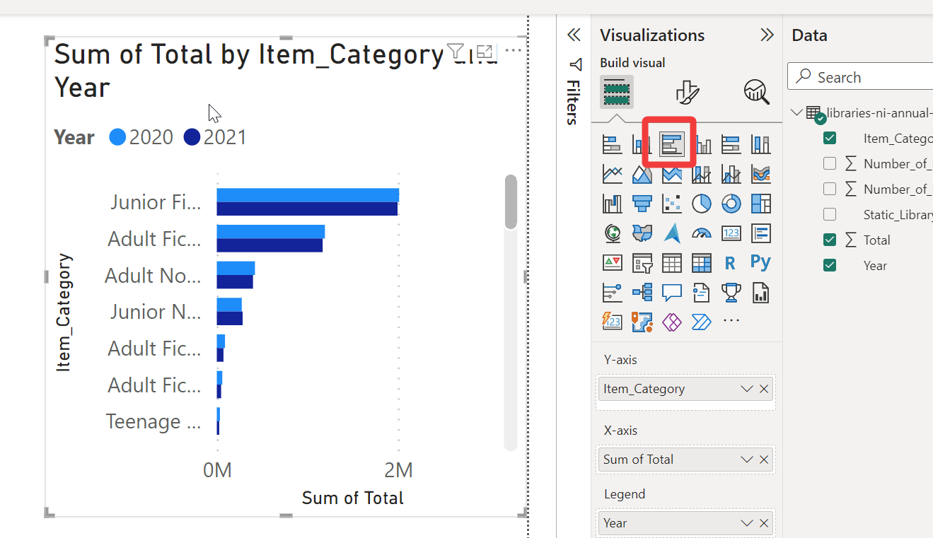
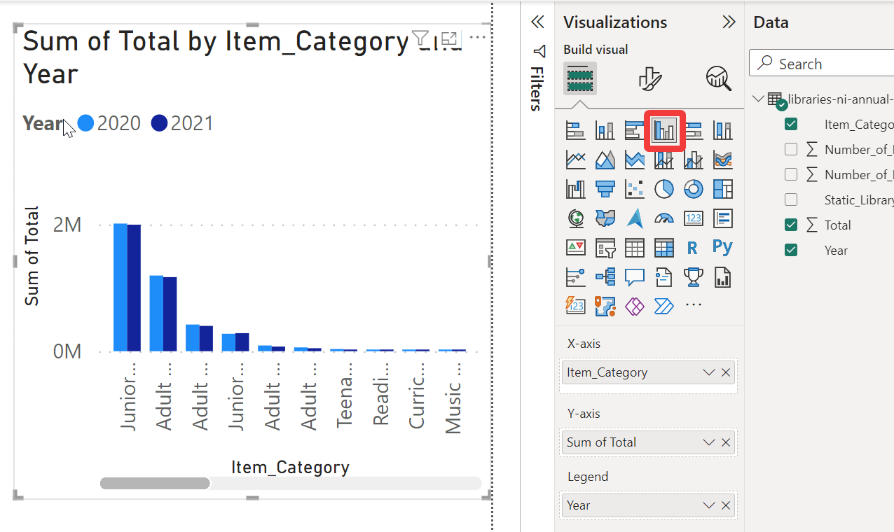
Once you have data displaying in your visual, go through each of the visualisation options and adjust the data elements to experiment.
Stacked bar chart
Stacked column chart
Clustered bar chart
Clustered column chart
100% Stacked bar chart
100% Stacked column chart
Line chart
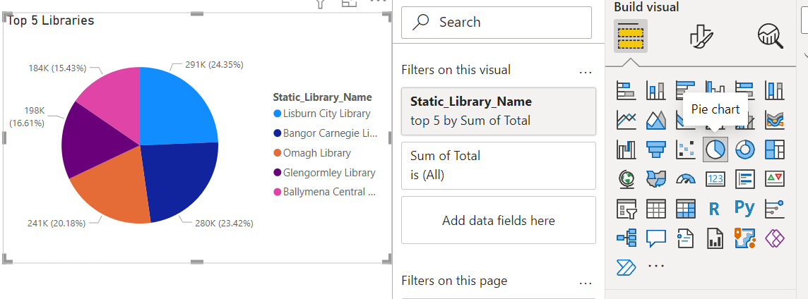
Pie charts
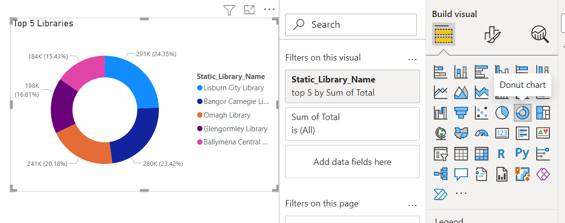
Donut charts
Ribbon
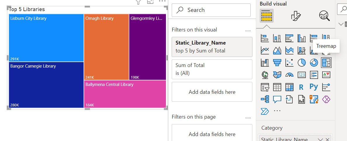
Treemap
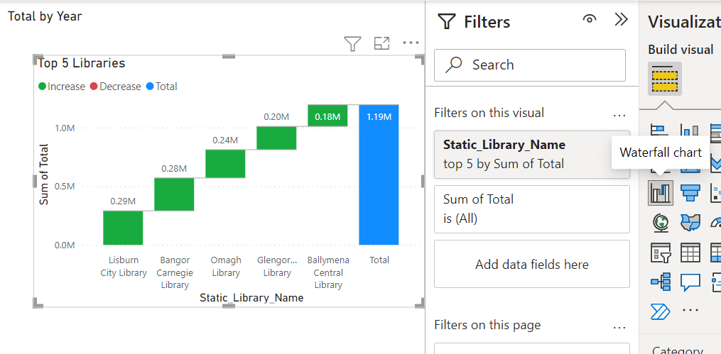
Waterfall
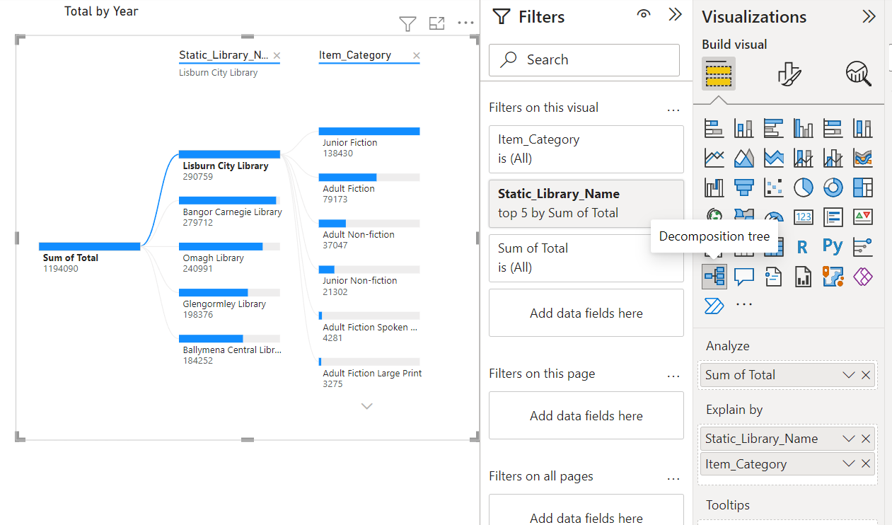
Decomposition Tree
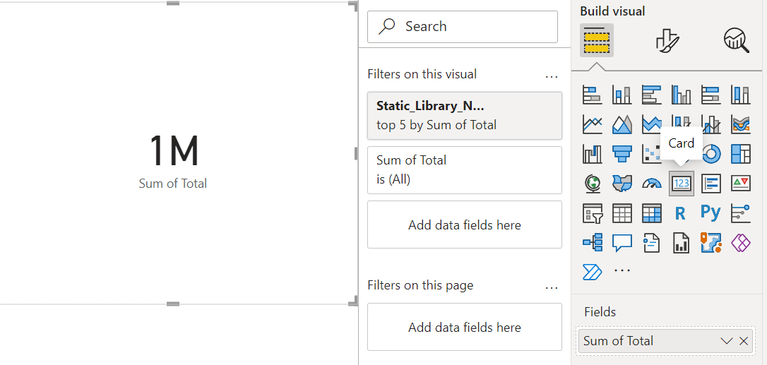
Card
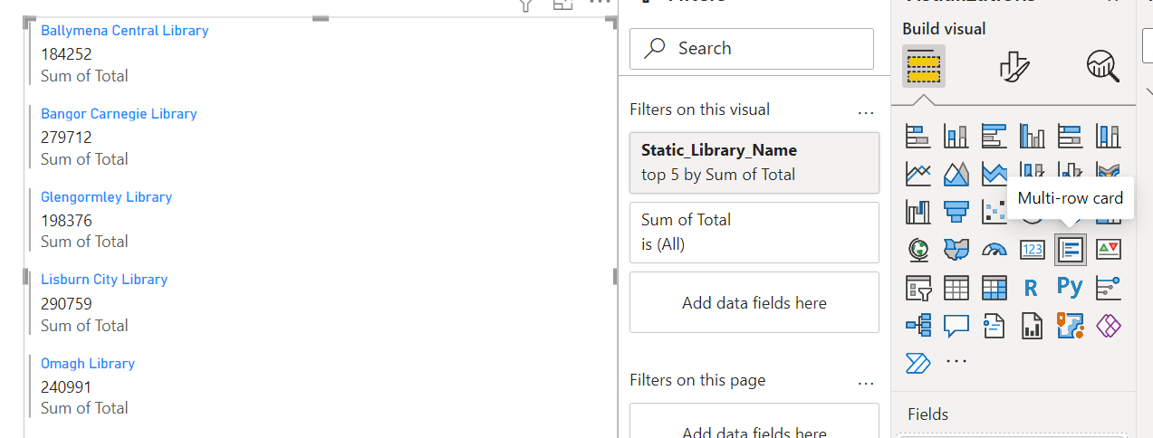
Multi card
Save the file
Section 3
Dashboard creation
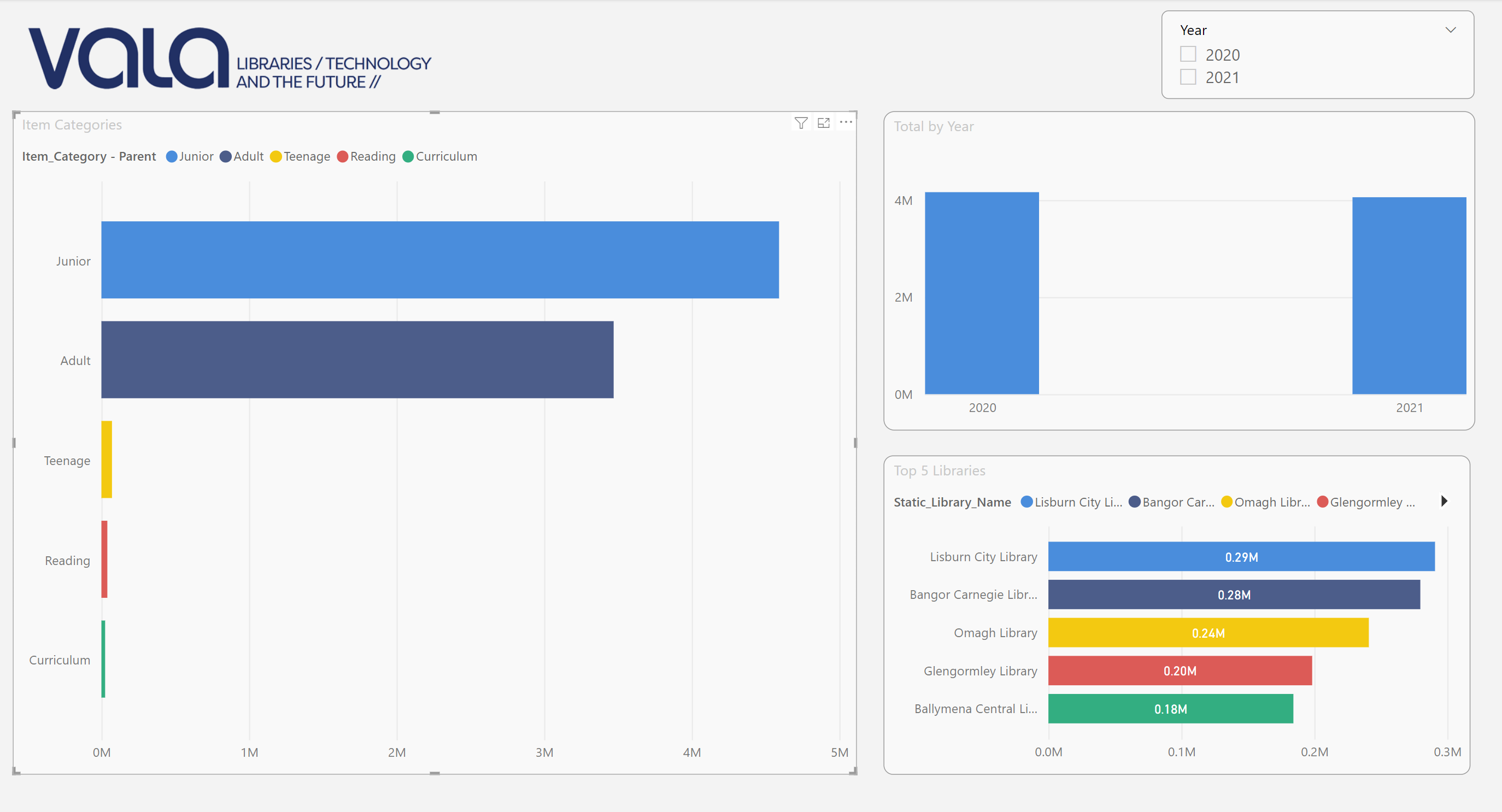
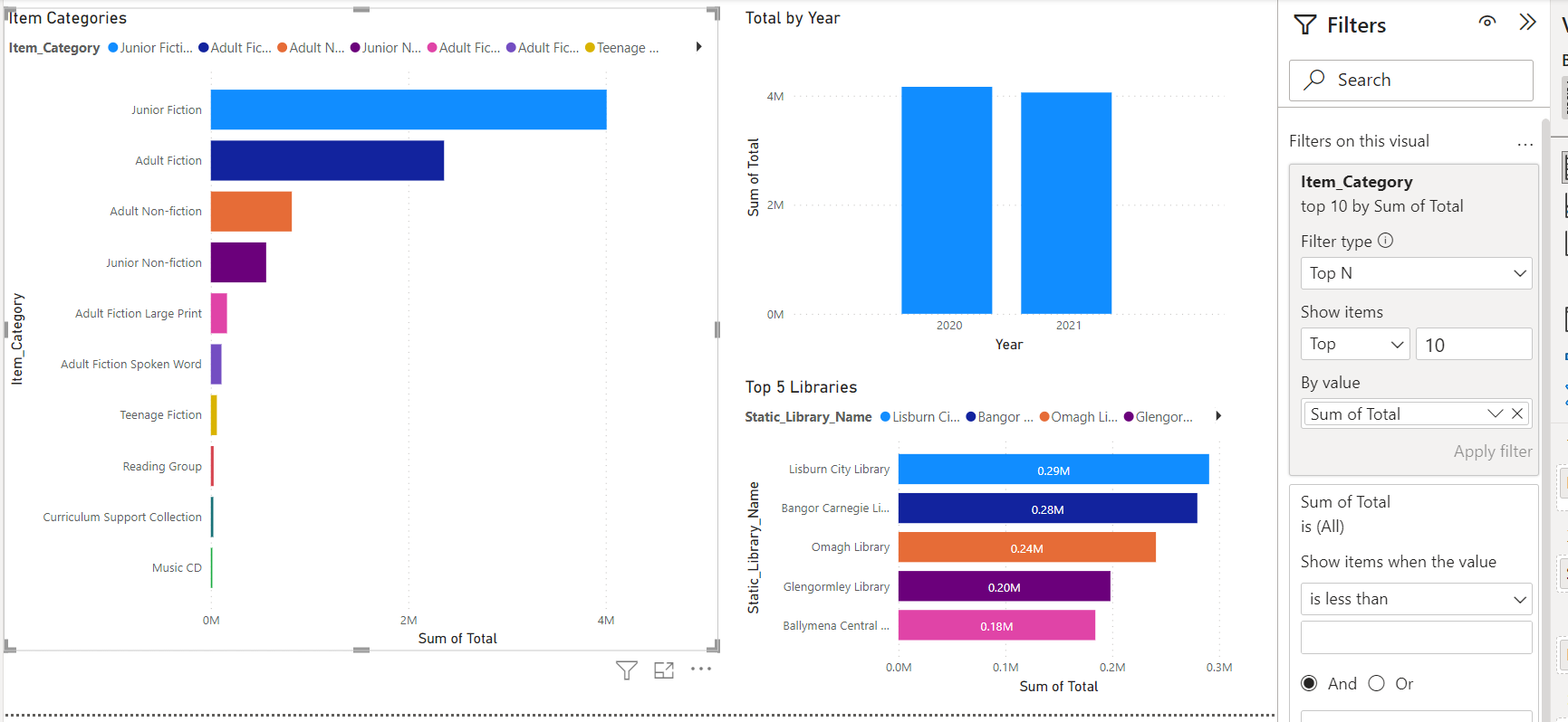
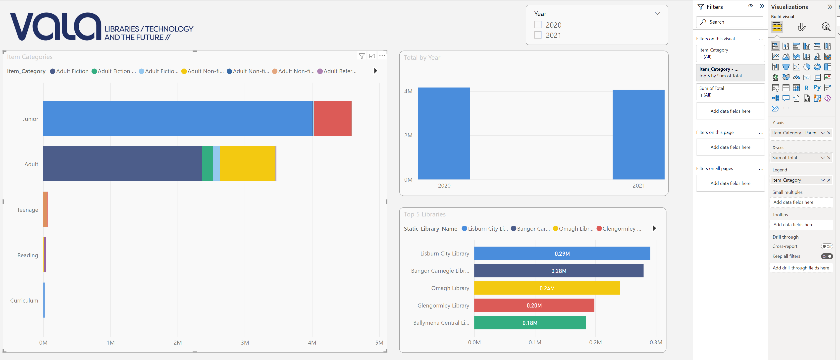
We have covered the most used visualisations in PowerBI, now we’ll start to use them to create dashboards.
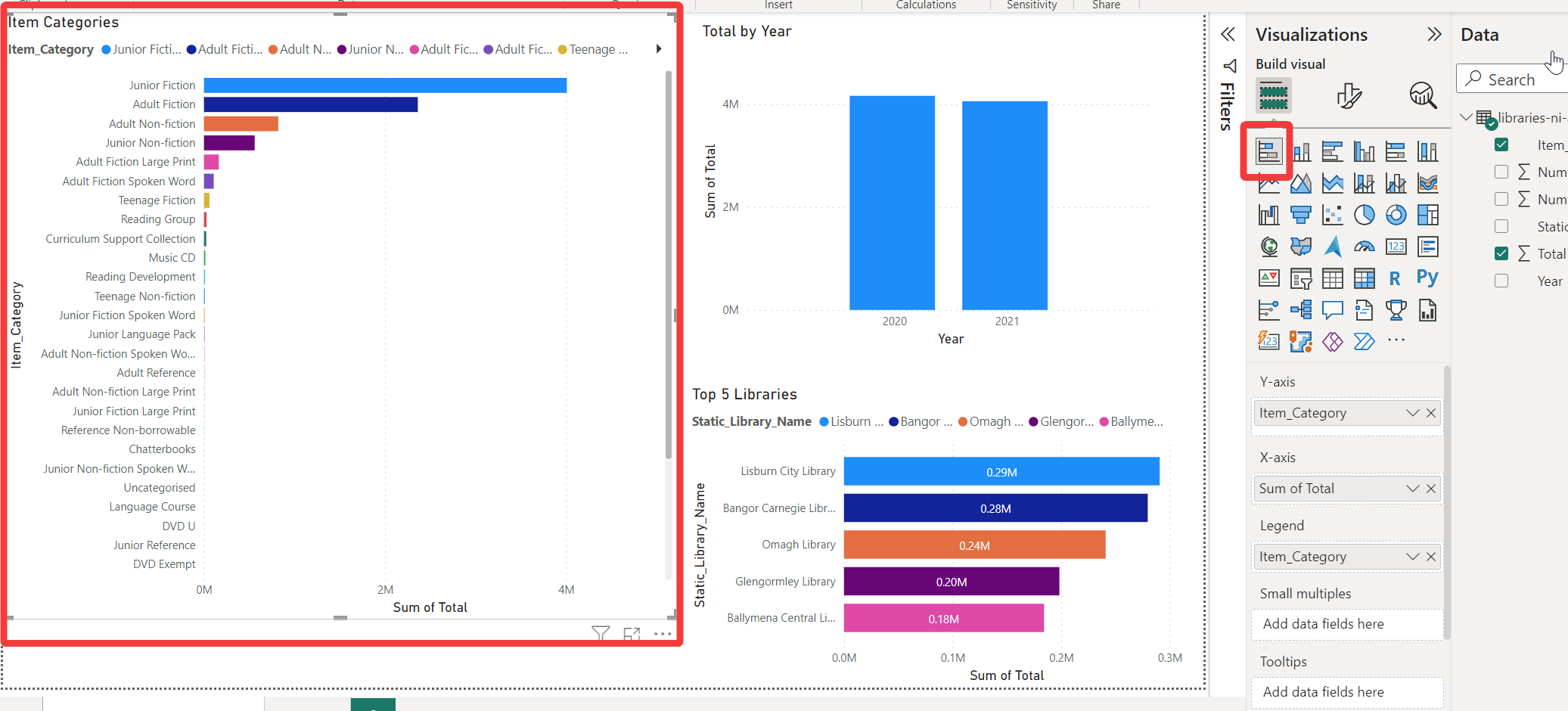
Dashboards are pages in PowerBI that can contain 1 or more visualisation - such as in the image below
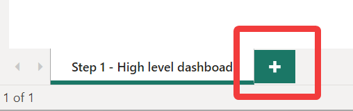
To make a new dashboard, click on the + icon at the bottom of the page - refer image below
And we’ll bring in 3 different visuals into the 1 page
For the first visual, click the Stacked column chart icon and put Year in the X-axis and Total in the Y-axis.
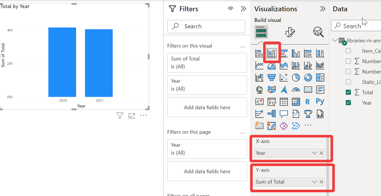
Next, click the Stacked bar chart icon and drag it below (or anywhere you prefer) the first visual and put Static_Library_Name in the Y-axis, Total in the Y-axis, and Static_Library_Name in the Legend.
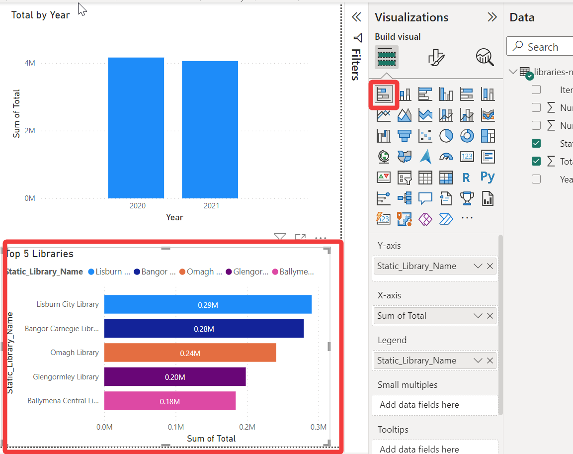
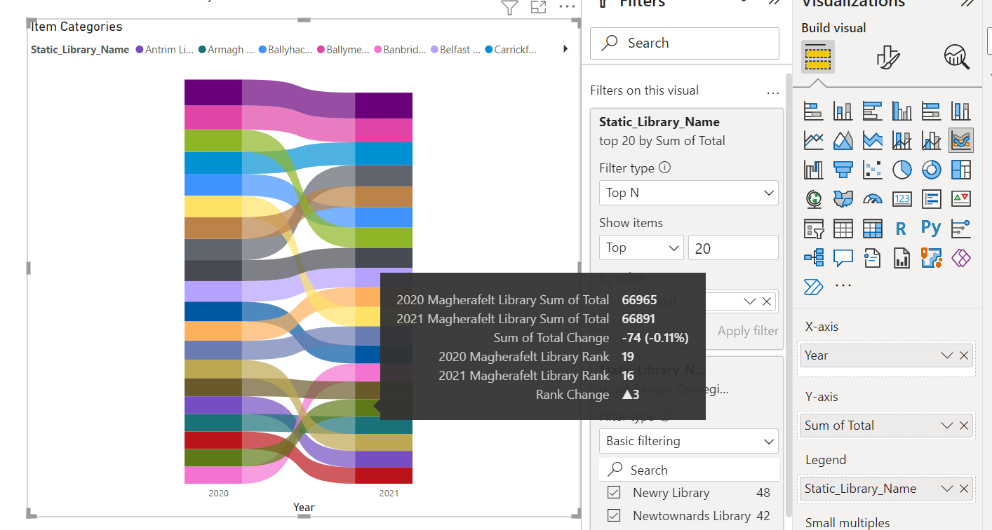
Next, click the Stacked bar chart icon again and drag it to the left (or anywhere you prefer) of the first visual and expand the height to the full length of the dashboard. Put Item_Category in the Y-axis, Total in the Y-axis, and Item_Category in the Legend.
Done, you’ve created your first dashboard!
Section 4
Make it pretty and add filters and slicers
Now we have the base dashboard created, the next step is to format the dashboard to improve the usability and visuals
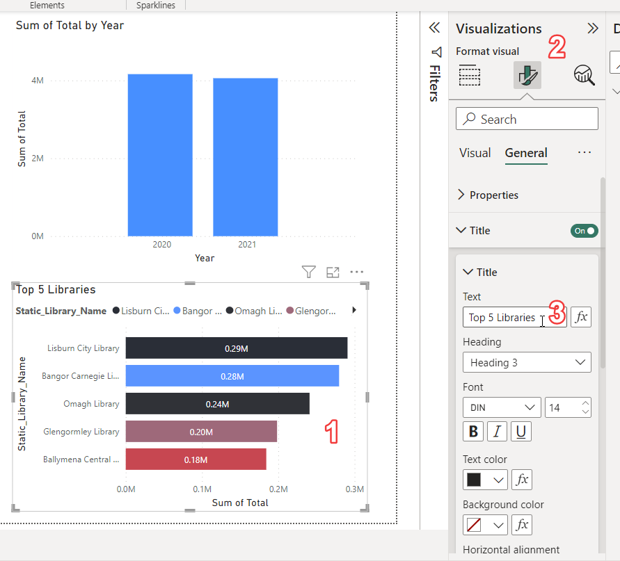
Change the title of a visualisation:
- Click the visualisation
- In the
Visualizationspane, select theformatsection - Open the
Titlesection and change theTextto the desired title you want
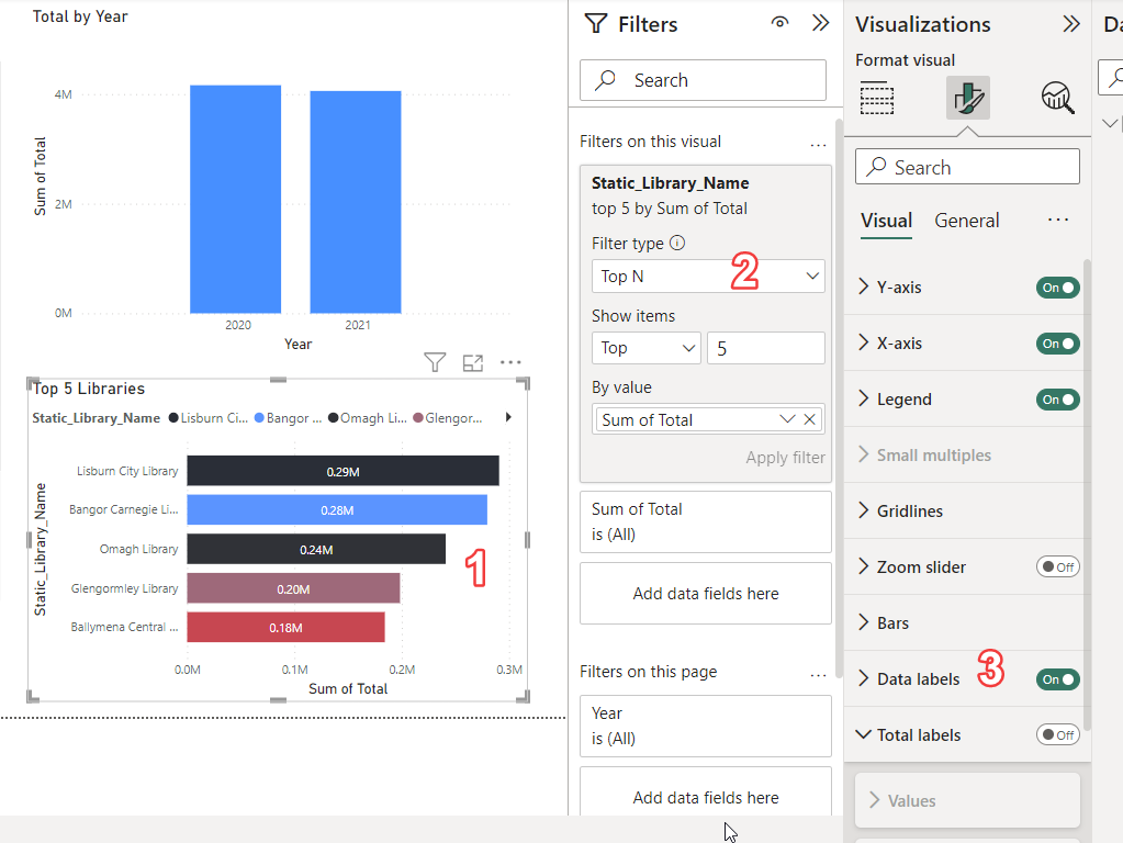
Filter a visualisation to top 5 items:
- Click on the visualisation
- In the
Fitlerspane selectFilters on this visual - Change
Filter typetoTop N - Enter
5in theShow itemssection - In
By valuedrag inTotalfrom the data pane
Add your logo to the top of the page
Download the logo if you don’t have it from https://github.com/justinkelly/vala_2023_techcamp_powerbi/blob/main/vala-logo.png
![]()
And from the Insert menu, select Image refer image below
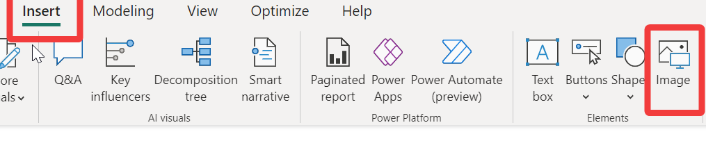
Select your logo, then resize and drag it to your preferred location
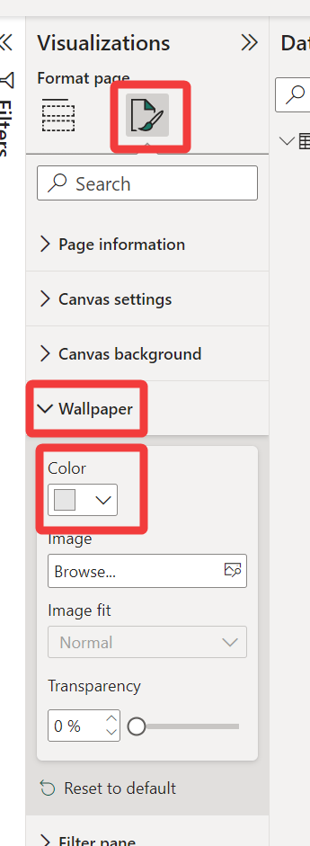
Change the background of the dashboard
Click on an empty space in your dashboard, select the Visualizations pane, then the Format page tab, then expand the Wallpaper section. Here you can select a colour, or image, and the dashboard background.
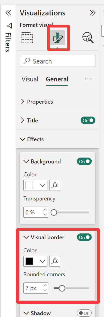
Add rounded borders to the reports
Click on a visualisation in your dashboard, then click Format visual from the Visualizations pane. Next, select the General tab, and expand the Effects section. Here, expand Visual board drag the slider below Rounded corners to adjust the size of the visuals rounded borders.
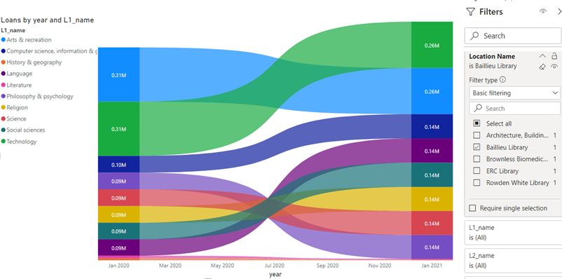
Add slicers
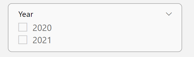
Slicers are very similar to filters, except they have a much easier to use and look much better on your dashboard.
To add a slicer to your dashboard, click on the Slicer icon in the visualisations list, then drag the data element you want to filter all reports on into the Field section. In our example, we’ll drag Year into the Field section.
Bring it all together
Once these formatting updates have been done, the dashboard should be easier to understand, nicer looking, and easier to use.
Section 5
Data manipulation
Review the data and notice the pattern in the Item Category names. How can we make all these categories simpler and easier to read?
To automatically group the item categories into groups of similar items, we can take the first word from each item category to create.
Such as group Junior Fiction, Junior Fiction Spoken Word and Junior Non-Ficton under a parent category of Junior.
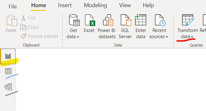
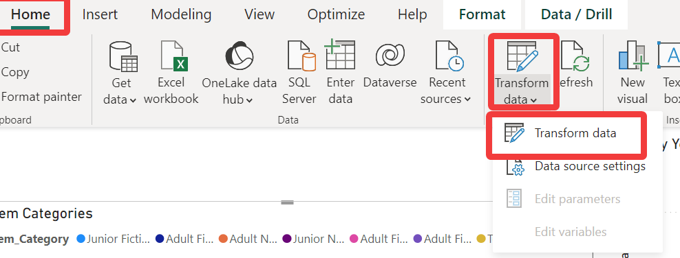
To do this, from the Home menu, select Transform data and then Transform data from the sub-menu.
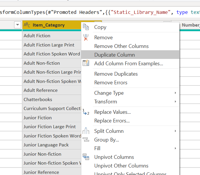
Right click on Item_Category and select Duplicate Column. This will enable us to edit a copy of this column to create the new parent group.
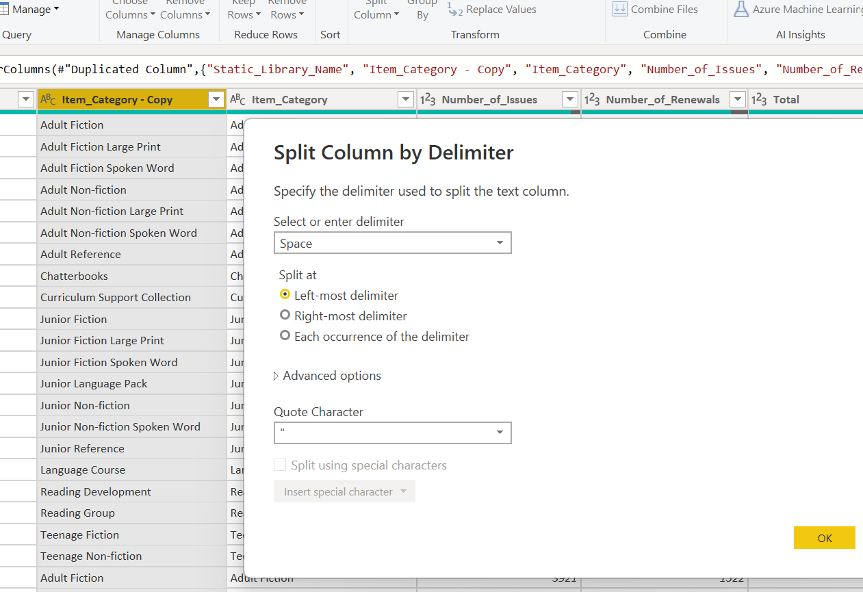
To grad just the first word of the item category, select Split Column from the menu, and then By Delimiter
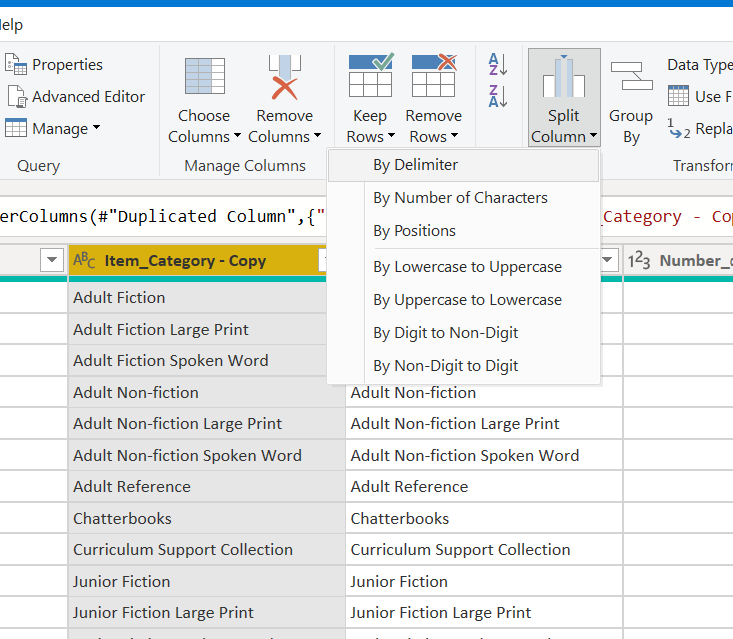
Choose Space as the delimiter and select Left-most delimiter in the Split at section, then click OK
This will create a new column which has only the first work of then Item Category. To clean up the data, delete the duplicate item category which has the full item category
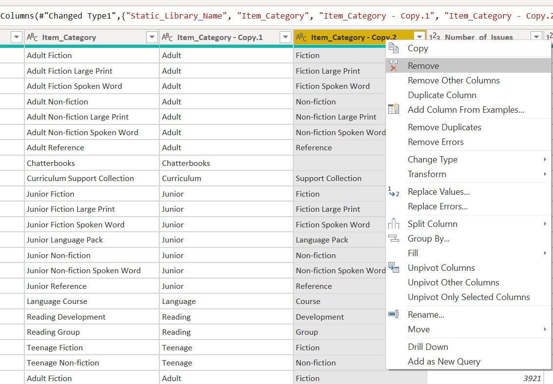
The result will be a new field with a parent category automatically created, with the original field - now as a child category
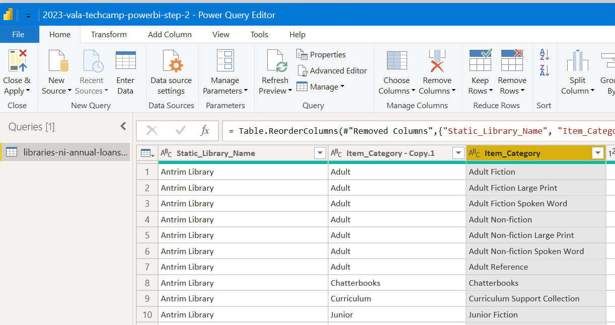
Then Close & Apply, and Save the file.
Section 6
Final changes
To use the new Parent Item Category - review the visual in the dashboard and adjust the Item Categories visual to use the new parent item category.
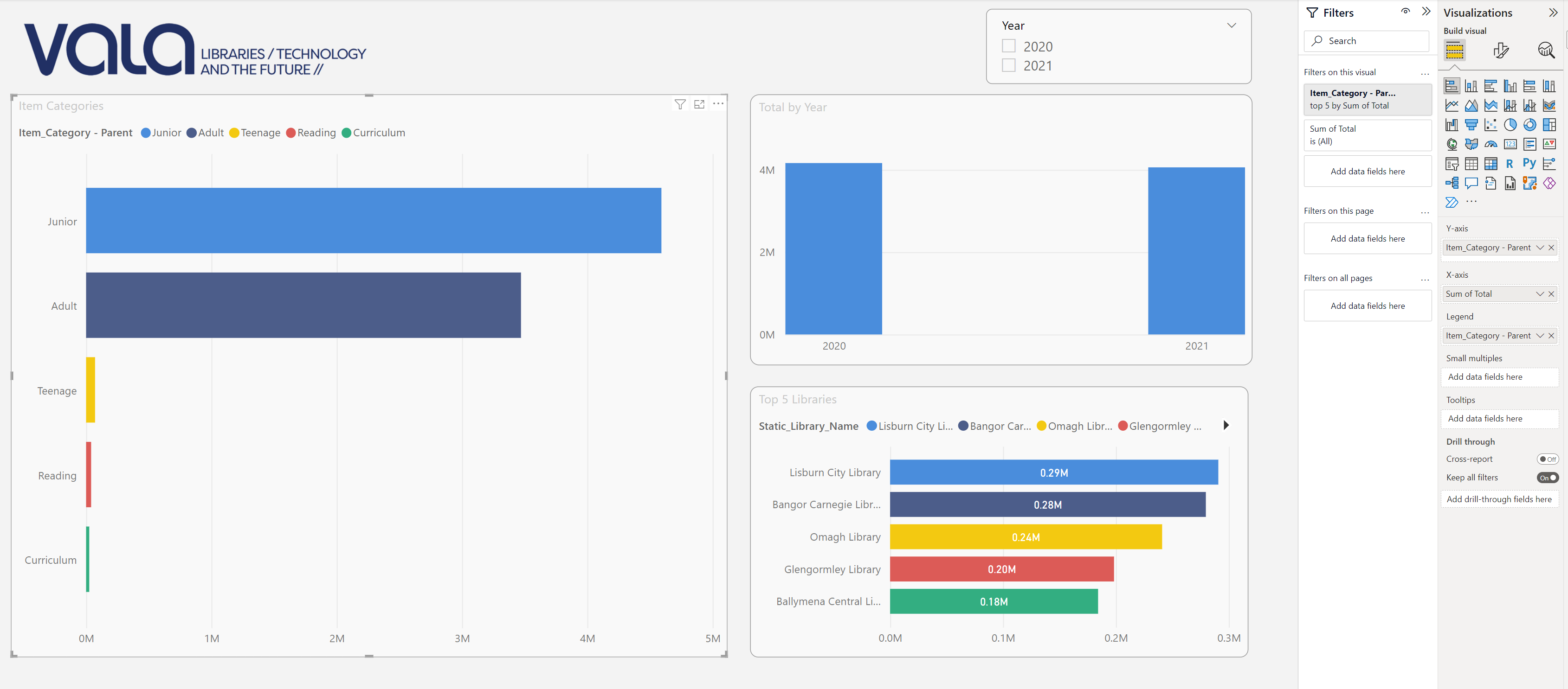
Then test adding item category and the parent item category into the same visual to further analyse the results.
Congratulations - You have finished creating and customising a dashboard in PowerBI!!
Section 7
Extra
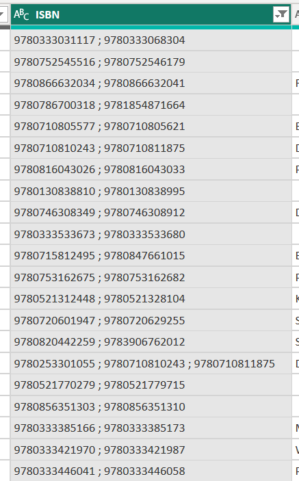
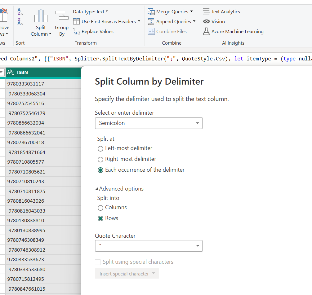
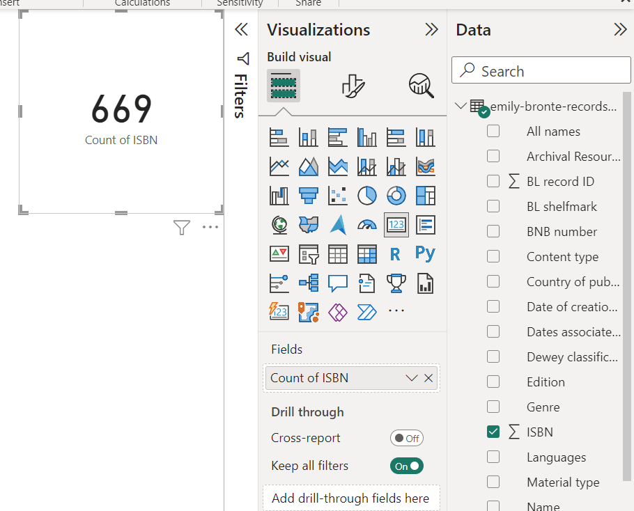
If you want to test yourself further, try and import the emily-bronte-records-british-library.csv file from https://github.com/justinkelly/vala_2023_techcamp_powerbi/blob/main/emily-bronte-records-british-library.csv into PowerBI and see if you can figure out how to count the distinct number of ISBNs in this dataset.
Noting that there can be multiple ISBNs in a single field
Refer below for steps on how to do this
